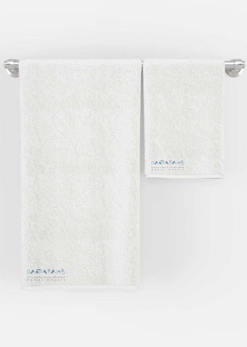
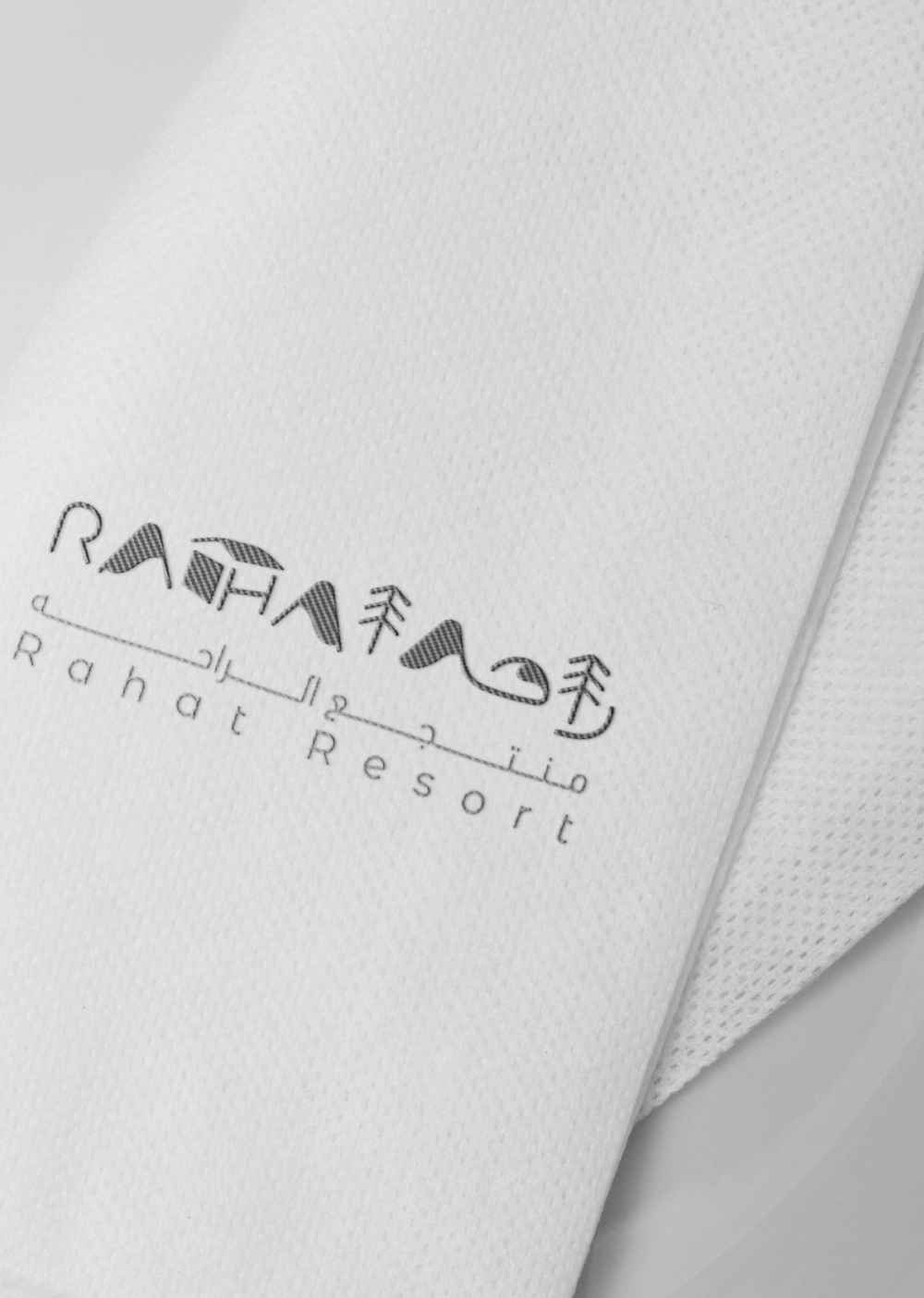
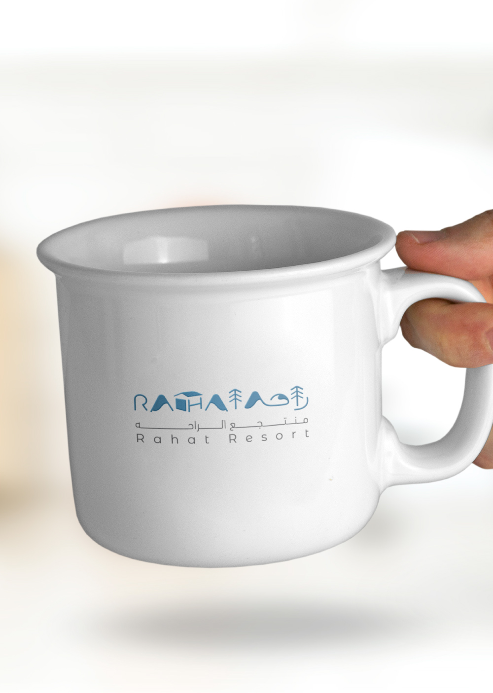
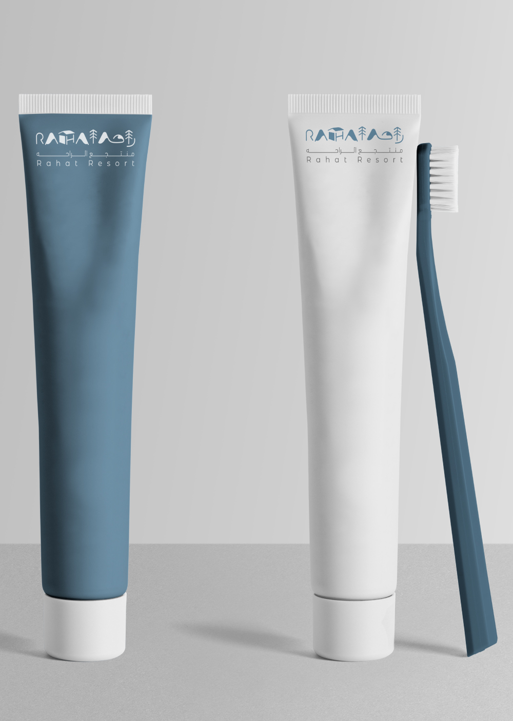
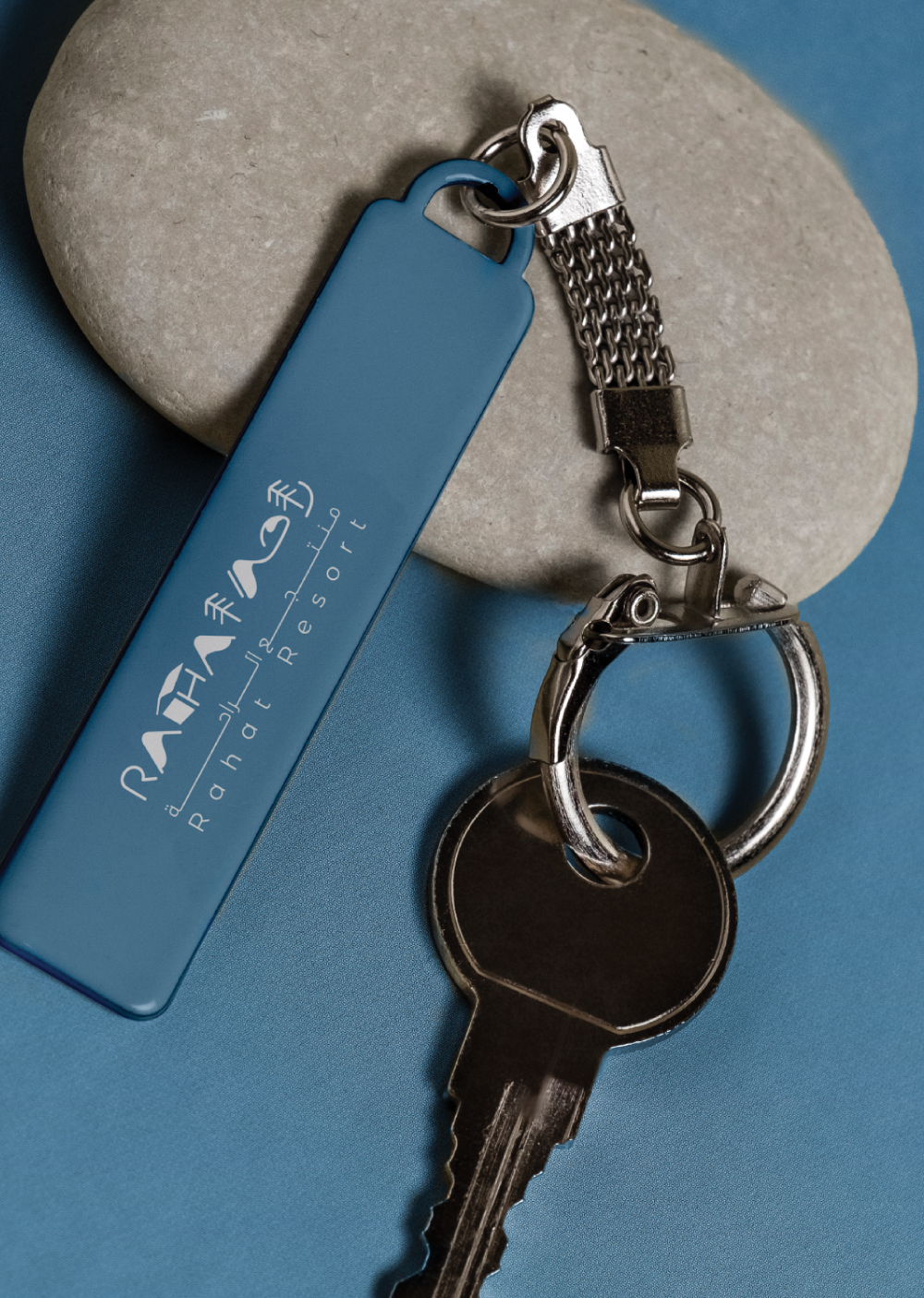
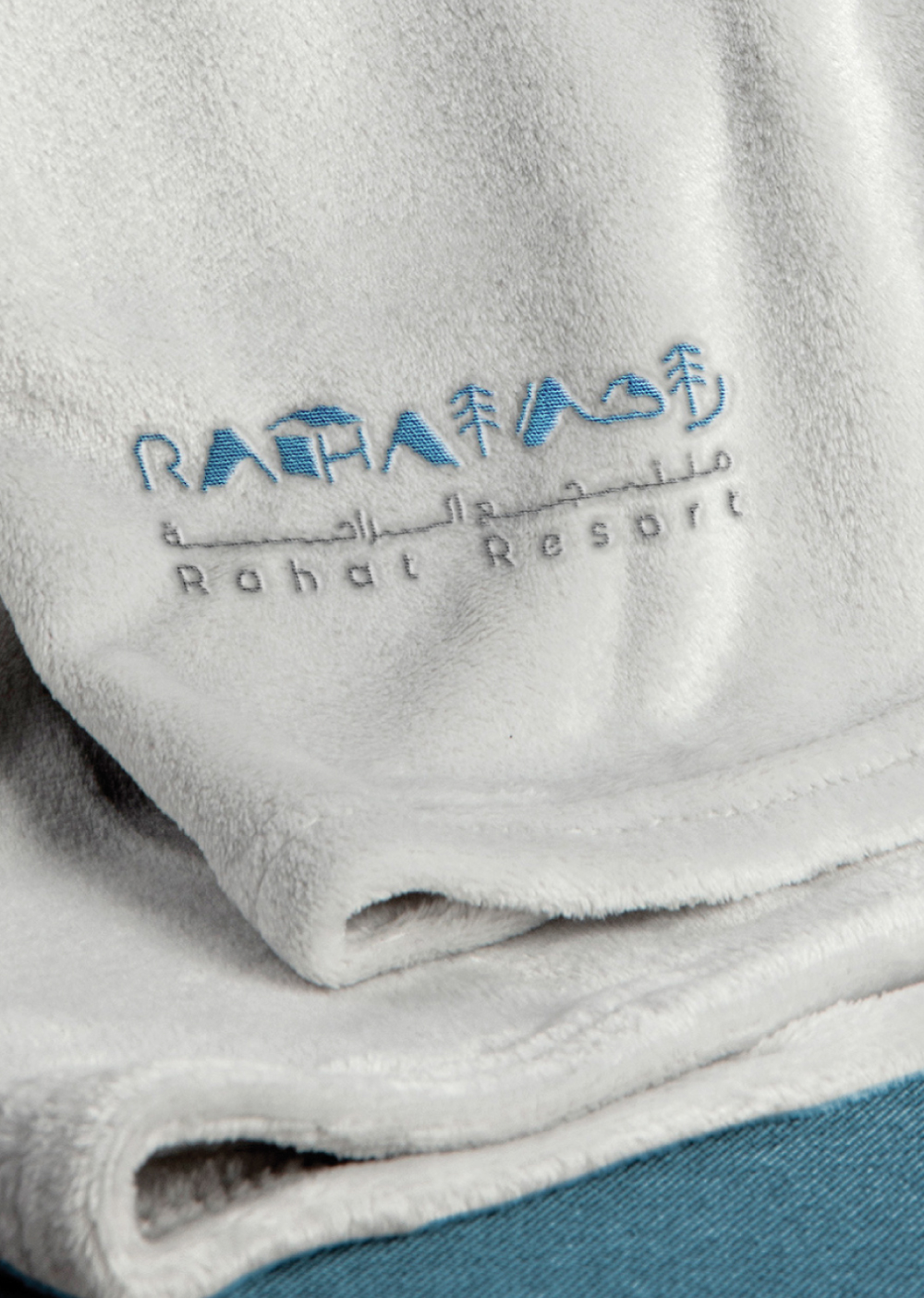
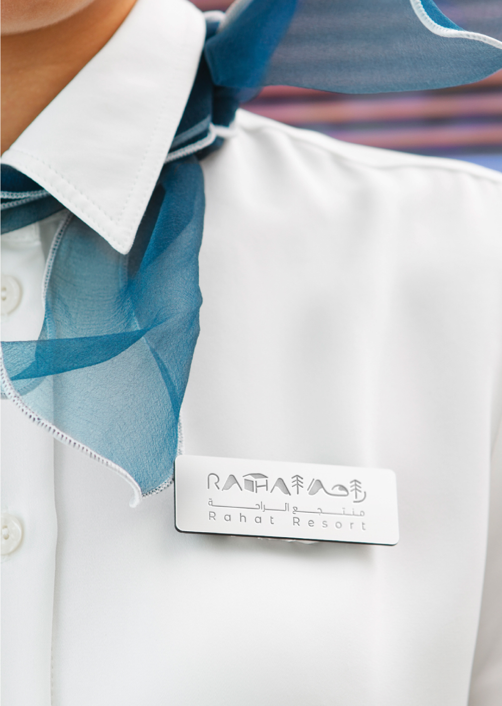
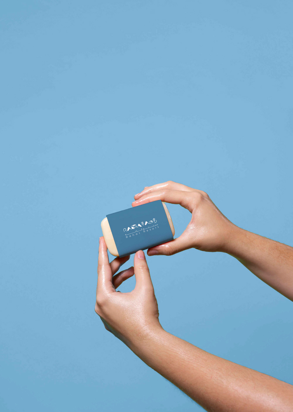
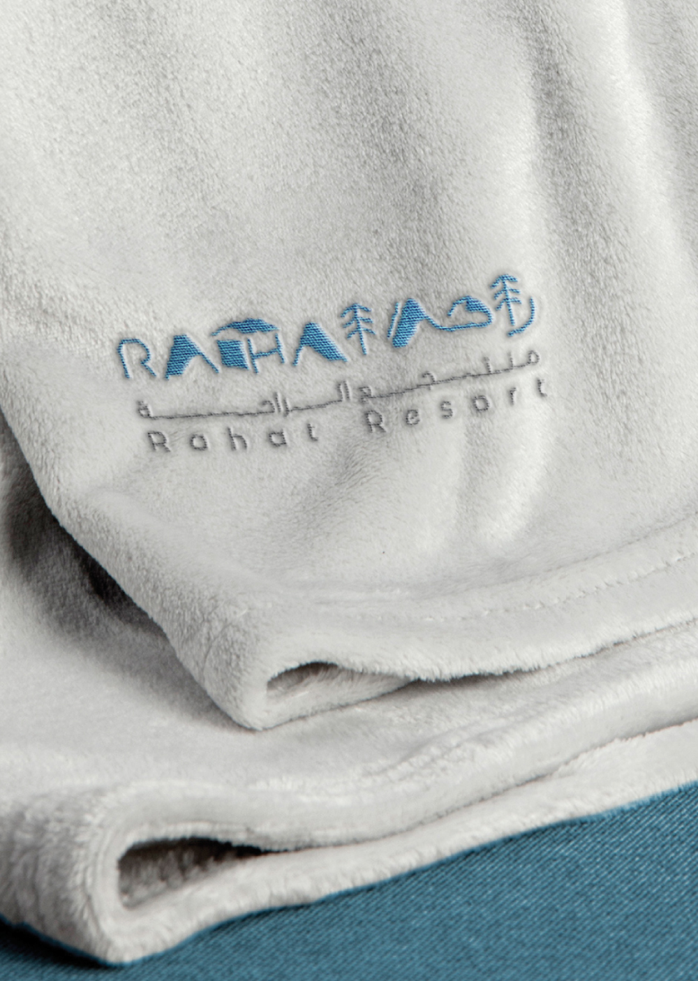
RAHAT RESORT
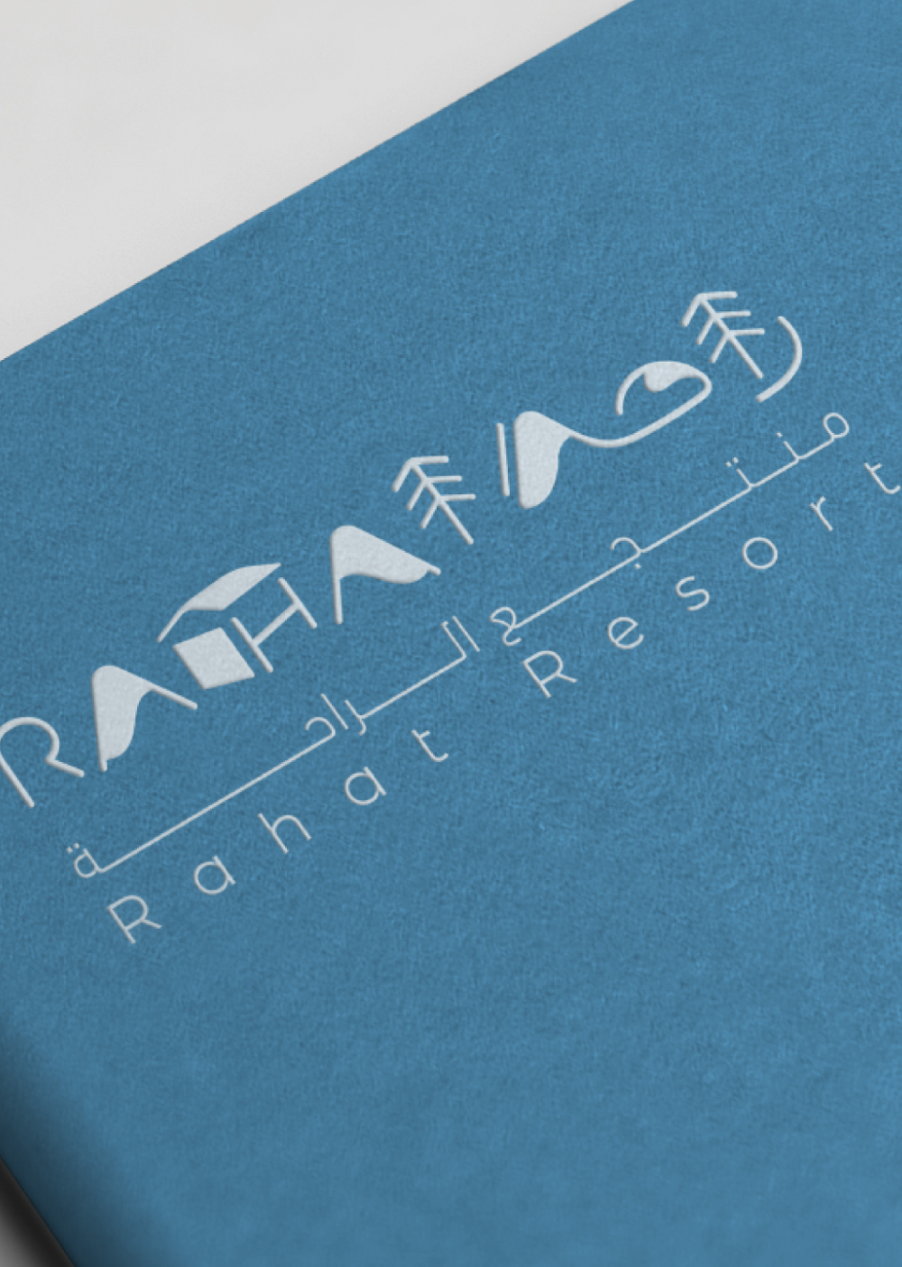
The Rahat Resort logo is more than just a typographic identity — it’s a visual narrative of the resort’s natural surroundings and peaceful ambiance, crafted through abstract yet meaningful letterforms.
A for Alpine Peaks
The letter “A” in both Arabic and Latin versions takes the shape of snow-capped mountains, evoking imagery of serene, elevated landscapes. It reflects the cool, calming retreat vibe that Rahat Resort promises — a place where guests can escape into nature’s quiet embrace.
Trees in Alif (ا) and T
Both the Arabic “Alif” and the Latin “T” have been creatively stylized to resemble trees. These vertical, rooted forms emphasize the idea of lush nature and sustainable beauty. They reflect the resort’s harmony with the environment and its commitment to green living.
H as a Symbol of Shelter
The letter “H” represents the resort itself — a haven in nature. Its structure resembles a simplified architectural form, symbolizing comfort, rest, and connection with the outdoors. It’s where luxury meets raw, untouched landscapes.