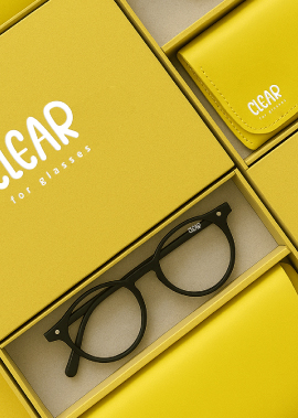
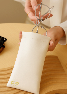
كلمة “CLEAR” شامخة – جريئة، دائرية، وصادقة بلا مواربة.
إنها ليست مجرد اسم علامة تجارية، بل وعد. إعلان. همسة بصرية تقول:
“رؤية أفضل. إحساس أكثر حدة. حياة أكثر وضوحًا.”
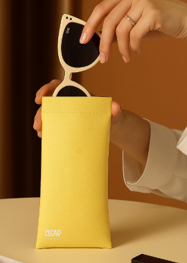
تحاكي حروف كلمة “CLEAR” الانحناءات الطبيعية لعدسات النظارات – ناعمة، انسيابية، وجذابة. هناك وضوح في المسافات، ولكن أيضًا لمسة مرحة، ولمسة إنسانية. تبدو الانحناءات المبالغ فيها وكأنها تشكلت بفعل النظر – تُحوّل الضوء إلى وضوح.
أسفلها، تظهر عبارة “للنظارات” بهدوء – بسيطة، واسعة، ومدروسة. كخط صغير لا يصرخ بل يُكمل الجملة. يُضفي سياقًا للجرأة أعلاه، كما لو أن الرؤية مدعومة بالتركيز.
THE WORD CLEAR STANDS TALL—BOLD, ROUNDED, AND UNAPOLOGETICALLY HONEST.
It’s not just a brand name — it’s a promise. A declaration. A visual whisper that says:
“See better. Feel sharper. Live clearer.”
The letterforms of CLEAR mimic the natural curves of eyeglass lenses — soft, fluid, and approachable. There’s clarity in the spacing, but also a playfulness, a human touch. The exaggerated curves feel almost like they were shaped through the act of looking — bending light into clarity.
Below it, “For Glasses” sits quietly — minimal, spacious, and intentional. Like fine print that doesn’t scream but completes the sentence. It gives context to the boldness above, like vision being supported by focus.